Reduce Website Bounce Rate (4 Easy Steps)

Nowadays, your website is the primary gateway to your business for people all over the world. But just getting visitors isn't enough. The real challenge is keeping them interested and browsing your site. That's where bounce rate matters - it shows if people are leaving too quickly. A high bounce rate is bad for your rankings and business goals.
Don't worry, though, reducing your bounce rate isn't too difficult. This article explains 4 easy steps to lower your bounce rate and keep visitors engaged on your site. By following the tips provided, you can enhance your website's content, design, and user experience. This will encourage visitors to explore more pages, ultimately leading to increased dwell time and conversions for your business. A low bounce rate demonstrates that your site is captivating and valuable to your audience.
Understanding Bounce Rate

What is Bounce Rate?
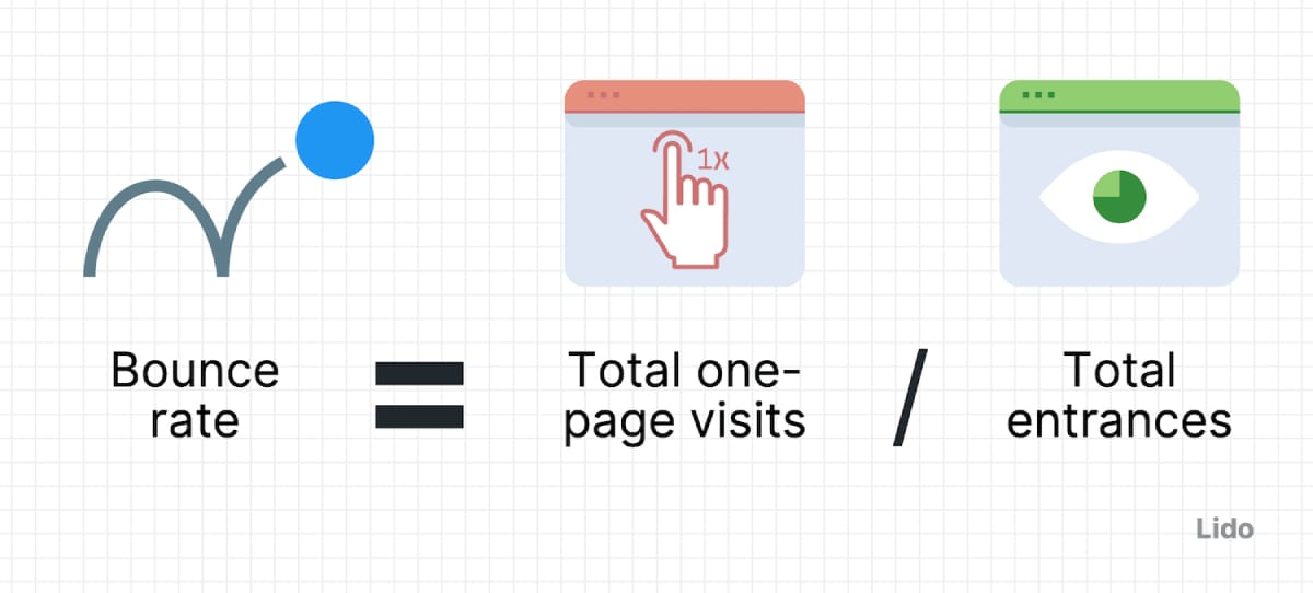
The bounce rate is a metric shown in analytics tools like Google Analytics that represents the percentage of visitors who enter your site and then leave ("bounce") rather than continuing to view other pages within the same site. Essentially, it measures single-page sessions divided by all sessions and indicates the quality of a visitor's initial engagement.
How is Bounce Rate Calculated?
Bounce rate is calculated by counting the number of single-page visits and dividing that by the total number of entries to a website. For example, if your site receives 100 visitors in a day, and 50 of them leave after viewing only the page they entered on, your bounce rate would be 50%.

Industry Benchmarks for Bounce Rates
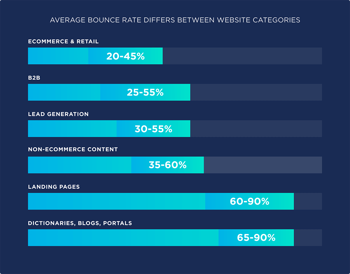
Bounce rates can vary significantly across different industries. For instance, retail sites might see bounce rates around 20-40%, while content-heavy sites like news platforms may experience rates as high as 60-70%. Knowing the average bounce rate for your specific industry can help you set realistic goals and benchmarks for improvement.

Impact of High Bounce Rate on a Website
A high bounce rate can be indicative of several issues:
- Poor User Experience: If your website is difficult to navigate, slow to load, or visually unappealing, visitors may leave promptly.
- Irrelevant Content: Visitors might bounce if the content they find isn’t what they expected or doesn’t meet their needs.
- Inadequate Call-to-Action: Without a clear call-to-action, visitors might not know what steps to take next, leading to higher bounce rates.
Understanding these aspects is crucial in addressing bounce rate issues and setting the stage for the actionable steps to mitigate them.
Step 1: Optimize Page Load Time

Page load time is a critical factor influencing both bounce rate and overall user satisfaction. Slow-loading pages can frustrate visitors, prompting them to leave before they have even had a chance to interact with your content. Improving page load times can significantly enhance user experience and reduce bounce rates.
How Page Load Time Affects Bounce Rate
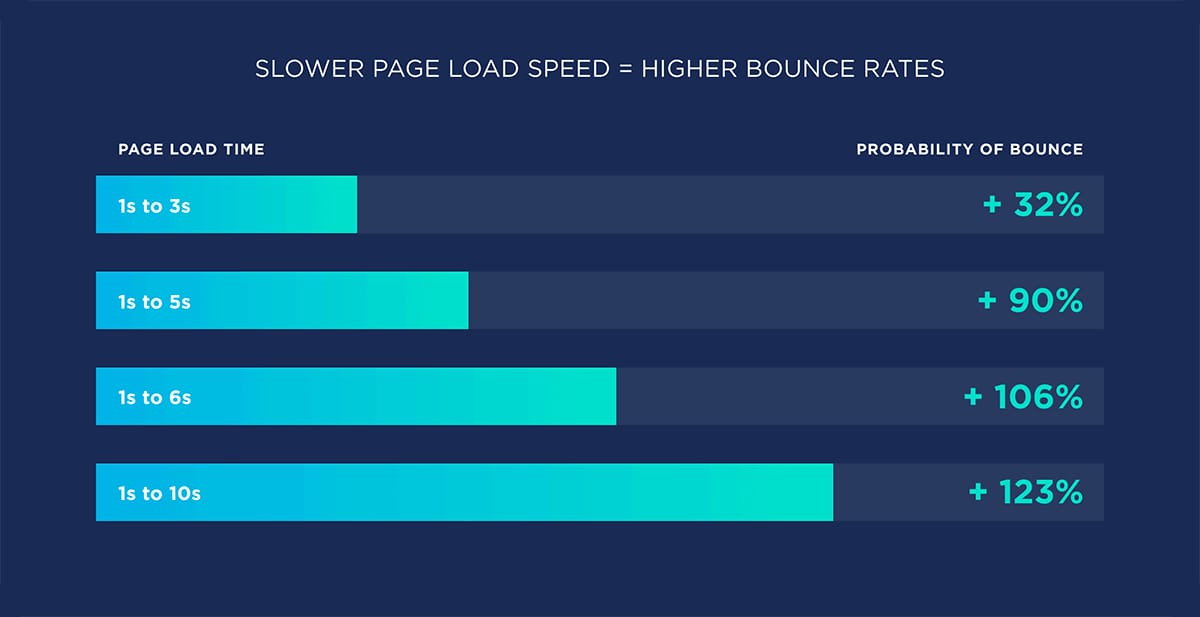
Studies have shown that pages that take longer than a few seconds to load can see significantly higher bounce rates. For example, as page load time increases from one to three seconds, the probability of a bounce increases by 32%. This percentage rises dramatically as loading time extends, underscoring the necessity for speed in web design.

Steps to Measure Current Page Load Time
- Use Speed Testing Tools: Tools like Google PageSpeed Insights or GTmetrix can provide a comprehensive analysis of your website’s loading performance, offering insights into what may be causing delays.
- Analyze the Reports: These tools not only measure how long your pages take to load but also identify specific problems such as large images, slow server response times, and excessive script loading.
Tips and Tools for Improving Page Load Times
- Image Optimization: Large images are one of the most common culprits behind slow page loading. Tools like TinyPNG or FreeConvert can reduce image file sizes without losing quality.
- Minimizing HTTP Requests: Each piece of your webpage (such as images, scripts, and stylesheets) requires an HTTP request to load. Simplifying your website design and combining files can decrease the number of requests made.
- Using Content Delivery Networks (CDN): CDNs distribute your content across multiple, geographically diverse servers, speeding up access to your website for users no matter where they are in the world.
Case Studies or Examples
For instance, a well-known e-commerce site reduced its load time by 2 seconds and saw a 20% decrease in bounce rate, significantly increasing customer satisfaction and sales. Another example is a news website that optimized image sizes and combined files, which cut its load time by 50%, resulting in a 15% lower bounce rate.
Improving your website’s load time can be one of the most effective ways to reduce its bounce rate and enhance user experience. The next step focuses on refining user experience further through design and navigation enhancements.
Step 2: Enhance User Experience

A website’s design and its navigation structure play a pivotal role in determining how users interact with the content. A well-designed website not only looks appealing, but also makes it easy for visitors to find what they're looking for, reducing frustration and decreasing bounce rates.
The Role of Website Design in User Experience
Good design goes beyond aesthetics. It encompasses usability, accessibility, and the overall journey a user takes through your website. A design that aligns with these elements can profoundly impact the effectiveness of your site, encouraging longer visits and more interactions.
Tips for Effective Website Design
- Responsive Design: Ensure your website is accessible and visually appealing on all devices, from desktops to smartphones. This adaptability reduces the likelihood of bounce due to poor user experience on mobile devices.
- Logical Navigation: Structure your navigation to flow intuitively. Users should be able to find desired information in as few clicks as possible. A clear, well-organized menu and a logical page hierarchy can guide users smoothly from one section to another.
- Clean and Attractive Layout: Avoid clutter that can overwhelm visitors. Use white space effectively to create a balance between text and visuals, making your content more digestible and your site more aesthetically pleasing.
Tools and Strategies to Test User Experience
- User Testing: Engage real users to test your site’s usability before going live. This can provide valuable insights into potential navigational issues and user frustrations.
- Heatmaps and Behavior Analytics: Tools like Crazy Egg and Hotjar offer heatmaps, scroll maps, and other visual reports that show you how users interact with your site, which can help identify what keeps them engaged and what drives them away.
Examples of Good vs. Bad Design in Terms of Bounce Rates
Consider a case where a tech blog revamped its layout to feature a more minimalistic design with better content categorization and instantly saw a 30% decrease in its bounce rate. Contrast this with a local restaurant's website that ignored mobile optimization, leading to a significant increase in mobile bounce rates as frustrated users left the site due to poor navigation and slow load times on their devices.
By focusing on user-friendly design and intuitive navigation, you can significantly enhance site engagement and minimize bounce rates. Implementing these changes might require some time and effort, but the long-term benefits in user retention and satisfaction are well worth it.
Step 3: Create Compelling Content

The foundation of any successful website lies in its content, and its quality directly influences visitor engagement and bounce rates. High-quality, relevant content can captivate an audience, encourage them to explore further, and significantly reduce the likelihood of bouncing.
Importance of Content in Keeping Visitors Engaged
Engaging content meets the needs and interests of your audience, providing them with value and reasons to stay longer on your site. Whether it's through informative blog posts, exciting videos, or interactive tools, good content delivers a compelling user experience and fosters deeper interaction with your brand.

Tips for Creating Engaging Content
- Understanding the Audience: Tailor your content to meet the specific needs and interests of your visitors. Use audience analytics to gather insights into their preferences and pain points, ensuring your content addresses these effectively.
- Using Engaging Headlines: Craft headlines that grab attention and make promises your content can keep. A strong headline encourages users to click through and read more, reducing the initial bounce.
- Incorporating Multimedia: Break up text with relevant images, videos, and interactive elements to keep the content dynamic and interesting. Multimedia elements can help illustrate points more clearly and add a layer of engagement that text alone may not achieve.
How to Use Analytics to Gauge Content Engagement
- Behavior Metrics: Analyze metrics such as time on page, pages per session, and interaction rates to understand how visitors interact with your content. Low engagement in these areas might indicate that your content is not resonating with your audience.
- Feedback Channels: Implement feedback tools like surveys or comment sections to directly ask your audience what they think of your content and what else they would like to see. This direct feedback can be invaluable in refining your content strategy.
Examples of Content Changes that Reduced Bounce Rate
A travel blog introduced a series of interactive maps and destination guides with high-quality photographs and saw its bounce rate decrease by 40% as readers spent more time engaging with the content. Similarly, a technical support site started using step-by-step tutorial videos, which resulted in a 25% lower bounce rate as users found the videos helpful and stayed longer to watch them.
Creating compelling content is not just about filling your site with information but about making that information accessible, relevant, and engaging. This approach ensures that visitors not only find what they are looking for but also discover more reasons to stay on your site.
Step 4: Implement Effective Calls-to-Action

Calls-to-action are pivotal in guiding your visitors through the website journey you want them to take. Effective CTAs can significantly decrease your bounce rate by clearly indicating the next steps users should take, whether it's subscribing to a newsletter, viewing a product, or reading another article.
The Importance of Calls-to-Action in Reducing Bounce Rate
A strong call-to-action serves as a signpost for visitors, pointing them toward valuable interactions and deeper engagement with your site. Without clear CTAs, visitors may feel lost and leave your site prematurely, thereby increasing the bounce rate.
Examples of Effective Calls-to-Action
- Subscribe to Our Newsletter: This CTA can effectively keep your visitors engaged beyond their initial visit by integrating them into your ongoing marketing efforts.
- Learn More About This Product: Directing users to detailed product information can encourage them to explore your offerings further, reducing the likelihood of a bounce.
- Watch the Video: This type of CTA can pull visitors deeper into your content, especially when the video is engaging and directly related to the content they are currently viewing.
Placement and Design of Calls-to-Action
- Visibility: Place your CTAs in prominent locations where visitors naturally focus, such as the end of an article or alongside the main content.
- Design: Use colors and fonts that stand out from the rest of the page but are still harmonious with the overall design. The CTA should catch the eye without being jarring.
A/B Testing Calls-to-Action for Best Results
A/B testing involves comparing two versions of a webpage to see which one performs better. Apply this method to test different CTAs to understand what works best for your audience:
- Test Different Verbiages: See how slight changes in wording can affect user response.
- Experiment with Colors and Sizes: Sometimes, a different color or a larger button can make a big difference in visibility and attractiveness.
Implementing effective CTAs is not just about reducing bounce rates—it’s about enhancing the overall user experience. By making it easy and appealing for visitors to take the next step, you not only keep them engaged but also drive them towards valuable interactions that benefit both the user and your business.
Final Thoughts
Lowering your site's bounce rate requires a well-rounded strategy that tackles several areas. This includes technical optimizations as well as enhancing content and interaction. By speeding up page load times, improving design and navigation, and creating compelling content, you can build a more engaging website environment.
This will entice visitors to spend more time on your site and interact more deeply with it. Placing effective calls-to-action strategically is also important. Implementing these steps won't just reduce bounce rates but will also strengthen your overall online presence and success. We build websites designed for maximum engagement and conversion—reach out to us for a consultation and let’s optimize your digital presence.
Key Takeaways
| Step | Key Takeaways |
|---|---|
| 1. Optimize Page Load Time | - Use speed tests. - Compress images. - Use CDNs. |
| 2. Enhance User Experience | - Use responsive design. - Simplify navigation. - Keep designs clean. |
| 3. Create Compelling Content | - Match content to audience. - Use multimedia. - Monitor with analytics. |
| 4. Implement Effective Calls-to-Action | - Place CTAs visibly. - Make CTAs eye-catching. - Test different CTAs. |


